


Table of Contents
- Family Photo Outfit Color Palettes That Always Work
- Coordinated Family Outfits vs Matching: Which Looks Better in Photos?
- Tips for Stress-Free Family Photos: Planning Outfits Without the Meltdowns
- Stylish Matching Family Outfits for Photos by Season and Setting
- Choosing Fabrics and Accessories for Photo-Ready Looks
- Making Matching Family Outfits Work After the Photoshoot
- Frequently Asked Questions
Last Updated: September 14, 2026
Family Photo Outfit Color Palettes That Always Work
The safest approach to stylish matching family outfits for photos is a tight, cohesive color palette rather than identical garments.
A family photo color palette is a limited set of two to four complementary colors repeated across every person's outfit. Most photographers recommend one dominant shade, one secondary tone, and one neutral.
Neutral Tones and Earthy Shades
Neutral tones and earthy shades are the most forgiving palettes for family portraits because they flatter nearly every skin tone and don't compete with your surroundings. Think cream, oatmeal, camel, olive, and soft brown.
These palettes work especially well for outdoor sessions in fall, when the landscape already leans warm. The basics of color theory explained by the Interaction Design Foundation help here: complementary colors sit opposite each other on the wheel, while analogous colors sit side by side and produce the calm, unified look most families want.
- Cream + camel + olive: warm, timeless, works in any season
- Oatmeal + rust + charcoal: grounded and slightly moody
- Soft white + sage + taupe: light and airy for spring sessions
Seasonal Palettes for Spring, Summer, Fall, and Winter
Seasonal palettes align your family's clothing with the light and landscape around you, which is half of what makes a portrait feel intentional.
Spring: pastel tones with a neutral anchor. Blush, powder blue, and soft butter yellow against cream. Summer: high-contrast brights or breezy whites. Coral, sky blue, and sand photograph beautifully near water. Fall: rust, mustard, deep burgundy, and forest green against denim or camel. Winter: jewel tones and rich neutrals. Emerald, navy, and cranberry against gray or ivory.
Coordinated Family Outfits vs Matching: Which Looks Better in Photos?
Coordinated family outfits almost always photograph better than identical matching sets, because coordination creates visual harmony while preserving each person's personality. Matching outfits flatten a group into a single visual block, which is why most portrait photographers steer families toward coordination.
The distinction matters more than most people realize:
| Approach | What It Looks Like | Best For | Trade-Off |
|---|---|---|---|
| Fully matching | Same print, same color, same cut | Newborn and toddler sessions | Can look dated and stiff |
| Coordinated | Shared palette, varied textures and cuts | Most family portraits | Requires more planning |
| Complementary | Two color families that balance | Large groups, extended family | Harder to get right |
| Accent matching | One shared color, everyone else neutral | Casual lifestyle shoots | Subtle, easy to execute |
A common mistake is treating "matching" and "coordinated" as the same thing, then buying four identical shirts. That reads as a uniform, not a family.
Tips for Stress-Free Family Photos: Planning Outfits Without the Meltdowns
Stress-free family photos come down to planning outfits in one sitting, at least two weeks ahead, and locking the decision so nobody reopens it. The meltdowns rarely come from the camera. They come from the morning-of scramble.
Start by pulling everything from closets you already own. Lay the family's options on a bed, photograph the arrangement, and check it against your palette. Plan for the least cooperative family member first, usually the toddler or teenager, and build the palette around what they'll actually wear.
- Choose your palette (2-4 colors) and write it down
- Pull existing pieces from every family member's closet
- Identify gaps and fill only those
- Lay everything out together and photograph it
- Do a full try-on at least three days before
- Pack the outfits the night before, shoes included
The 3-3-3 Rule for Outfit Planning
The 3-3-3 rule is a simple planning framework: three colors maximum, three textures across the group, and three weeks of lead time.
Three colors is enough to feel cohesive without looking staged. Three textures (say, chunky knit, smooth cotton, and denim) add depth that flat, single-fabric outfits lack. And three weeks gives you time to order, exchange, and re-plan without panic. A guide to reducing decision fatigue from the American Psychological Association explains why locking decisions early works: every open choice drains the attention you need for the actual day.
Stylish Matching Family Outfits for Photos by Season and Setting
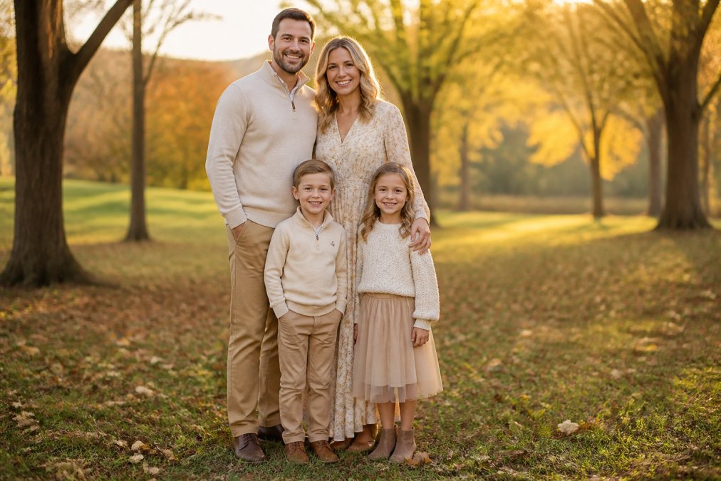
Season and setting should drive the outfit, not the other way around. An outfit that looks perfect in a sunlit field can look washed out in a dim studio, and vice versa. The biggest variable most families overlook is how their fabrics interact with the light at their location and time of day.
How Lighting and Fabric Interact at Your Location
Before you pick a single garment, ask your photographer two questions: what time is the session, and what is the dominant light source? The answers determine which fabrics flatter your family and which fight the camera.
Golden hour (roughly the hour after sunrise or before sunset): Warm, low-angle light wraps skin tones and makes matte fabrics, cotton, linen, wool knits, bamboo viscose, read as rich and dimensional. Satin, sequins, and high-sheen synthetics catch that low light and produce hot spots that blow out detail. Lean matte and one shade warmer than you think you need.
Midday sun: Harsh, overhead light creates deep shadows under eyes and noses. Light, breathable mid-tones diffuse better than dark solids, which crush into black in shadow. Avoid stark white, which clips to pure white and loses all texture.
Open shade (under a tree, beside a building): Soft, even light is the most forgiving for any fabric, but cool-toned colors can turn gray or blue. Warm neutrals, cream, camel, oatmeal, hold their color best in shade.
Studio lighting: Strobes and softboxes flatten texture and amplify sheen, so matte fabrics win decisively. Richer, deeper colors (forest green, burgundy, navy) hold up because they don't wash out the way pastels can. Layering, a cardigan over a tee, a vest over a button-up, adds the dimension flat studio light removes.
Seasonal Palettes That Match the Light
Seasonal palettes align your family's clothing with the light and landscape around you, which is half of what makes a portrait feel intentional.
Spring: Pastel tones with a neutral anchor. Blush, powder blue, and soft butter yellow against cream. Spring light is soft and diffused, so these lighter tones hold up well. Avoid pure white, it can read as blown-out against new green foliage.
Summer: High-contrast brights or breezy whites. Coral, sky blue, and sand photograph beautifully near water, where light bounces and fills shadows. Linen and cotton breathe and move in wind. Skip heavy knits and dark solids that absorb heat and light.
Fall: Rust, mustard, deep burgundy, and forest green against denim or camel. Fall light is warm and low, so these saturated earth tones read as rich rather than muddy. This is the most forgiving season for almost any palette.
Winter: Jewel tones and rich neutrals. Emerald, navy, and cranberry against gray or ivory. Winter light is cool and flat, so deeper, saturated colors hold their own where pastels would go gray. Add texture, chunky knits, flannel, corduroy, to compensate.
Indoor vs. Outdoor Photoshoot Looks
Indoor sessions reward richer color and texture because studio lighting flattens subtle differences. Outdoor sessions reward lighter, breathable fabrics that move with wind and natural light.
For indoor: lean into knits, layers, and deeper tones. For outdoor: prioritize fabric breathability and avoid busy prints that fight the background. The FTC's guidance on textile labeling and fiber content is worth knowing if you're ordering online, since fiber content directly affects how a garment drapes and photographs.
For a holiday card or a cozy at-home session, the SoftSnooze™ Dear Santa Christmas Pajama at $36.00 gives the youngest family member a coordinated look that still reads as comfortable. Pair it with the SoftSnooze™ Girls Dear Santa Ruffle Pajama and the SoftSnooze™ Boys Dear Santa Pajama Set, both $46.00, and the whole family lands in one nostalgic red-and-green palette without wearing the identical garment.

Choosing Fabrics and Accessories for Photo-Ready Looks
Fabric choice affects a photograph more than color does. Matte fabrics absorb light and photograph as rich and even, while shiny fabrics reflect it and can blow out under flash. That mechanism, absorption versus reflection, explains almost every fabric decision you'll make.
Why Some Fabrics Photograph Better Than Others
Cotton, linen, chunky knits, and bamboo viscose photograph well because their textured surfaces scatter light rather than bouncing it straight back at the lens, creating the soft, even look of professional galleries. Satin, sequins, and high-sheen synthetics act like mirrors, they send light directly back, creating hot spots, blown highlights, and glare in group shots.
A practical rule: if a fabric looks shiny on the hanger under a store light, it will look shinier on camera. If it looks matte and slightly textured, it will photograph as rich and dimensional.
For babies and toddlers, a bamboo viscose piece like the Red Knit Ruffle Romper at $44.00 gives you soft texture and ruffle detail that reads clearly on camera without being fussy.

Styling for Every Body Type in the Family
Most outfit guides skip the question that determines whether a family member feels good in the photos: does this silhouette work for their body? A few principles make coordination inclusive rather than one-size-fits-all.
Balance volume with structure. If one family member wears a flowy maxi dress or a loose knit, pair another in a more structured piece, a tailored button-up, a fitted jacket, straight-leg pants. The contrast reads as intentional coordination rather than everyone wearing the same silhouette.
Use vertical lines to elongate. Open cardigans, long necklaces, and button-up shirts worn open create vertical lines that photograph as slimming and add visual interest to a group shot.
Choose necklines that frame the face. V-necks, scoop necks, and collared shirts draw the eye upward toward faces, which is where you want attention in a family portrait. Crew necks and turtlenecks can work, but they tend to flatten the neckline in photos.
Let each person pick their own cut within the palette. The palette is shared; the silhouette is personal. A dad in a fitted henley, a mom in a wrap dress, a teen in an oversized cardigan, and a toddler in a romper can share the same three colors and still look like themselves.
Size up rather than down when in doubt. Clothing that's slightly too tight creates pulling and bunching that photographs as tension. A half-size of breathing room photographs as ease.
Accessories as the Accent Layer
Accessories should be the accent layer, not the main event. One or two accent pieces per person is plenty.
The most useful accessory trick is repeating one accent color across every person, a rust scarf on mom, a rust hair bow on the toddler, rust socks on dad. It creates a visual thread without requiring matching garments.
Avoid accessories that dangle, jingle, or distract, large statement earrings, noisy bracelets, and oversized hats that cast shadows on faces. For kids, skip anything they'll want to take off within five minutes.
Making Matching Family Outfits Work After the Photoshoot
The outfits you buy for a portrait shouldn't retire the moment the session ends, that's what makes the purchase worth it.
Build photo-day looks from pieces your family will wear again. A neutral knit, a solid button-up, and well-cut pants all work for school, errands, and gatherings. The session becomes an excuse to upgrade the wardrobe rather than a one-time costume.
Sustainability fits here too. Thrifting and swapping pieces with other families keeps costs down and keeps good clothing in circulation. If you're buying new, prioritize pieces that cross seasons and settings, and check sizing carefully before ordering. A consumer resource on clothing care and textile longevity from the American Cleaning Institute can help you keep those pieces looking sharp through repeated wear.
Photograph the finished outfit layout on your phone before the session. If a piece only works for the photo and nowhere else, swap it for something your family will actually reach for again.
Family photos come with real pressure: coordinating four people, working around a photographer's schedule, and hoping the outfits hold together on the day. MK Collective was built by Mallory and Kasey to take some of that weight off, with a curated selection of comfortable, on-trend clothing for women and children in one place, plus affordable pricing that makes outfitting the whole family realistic. Start with a palette, build from pieces you'll wear again, and let the boutique handle the rest. Explore all collections at MK Collective and find coordinated looks your family will love long after the shutter clicks.
Frequently Asked Questions
Should family photo outfits match exactly?
Exact matching can look dated and stiff in photos. Most photographers recommend coordinated looks instead, where you pick a shared color palette and let each person wear different pieces within that scheme. This creates visual harmony without the cheesy uniform effect. For example, choose navy, cream, and blush, then mix those colors across everyone's outfits. Coordinated family outfits vs matching is really about balance: you want the group to feel connected but still show individual personality.
What is the 3-3-3 rule for family photo outfits?
The 3-3-3 rule is a simple styling framework: pick three colors, three patterns, and three textures across the whole family's outfits. This keeps the group visually interesting without becoming chaotic. For instance, use navy, white, and tan as your three colors; add stripes, plaid, and a solid as your three patterns; then mix in knits, denim, and linen for texture. The result is a coordinated look that photographs beautifully and feels effortless rather than forced.
What colors look best for family photos?
Neutral tones like cream, tan, gray, and olive work well for any season and location. For a warmer feel, try terracotta, mustard, and rust in fall, or blush, sage, and light blue in spring. Avoid neon shades and large logos, which distract from faces. A good rule is to pick two to three complementary colors and let everyone choose pieces within that range. This approach to family photo outfit color palettes keeps the focus on your family, not the clothing.
How can I make family outfits look stylish rather than cheesy?
Skip the head-to-toe matching pajama look unless it is a holiday card theme. Instead, build around a shared color scheme and vary the silhouettes. One person wears a dress, another wears a button-down, a child wears a romper. Add layering with cardigans, jackets, or vests for depth. Choose fabrics with texture like chunky knits or linen to add visual interest. The goal is coordinated, not identical, so each person still looks like themselves while the group feels cohesive in photos.